
AI-Powered Therapy: Creating Personalized Mental Health Support Through Character Integration
ROLE: Full stack designer
TIMELINE: 8 weeks

PROJECT OVERVIEW
Haven AI is an innovative mental health platform that combines artificial intelligence with personalized character interactions to provide accessible, 24/7 therapeutic support.
PROBLEM
Traditional relationship therapy faces significant barriers including high costs, scheduling conflicts, and stigma around seeking couples counseling. Many couples need immediate support during conflicts but lack access to qualified therapists, leading to relationship deterioration and emotional distress.
APPROACH
Led an agile development process focused on rapid iteration and product-market fit discovery: conducted continuous user testing with couples, designed personalized AI relationship coaches, developed evidence-based conversation flows, and iteratively refined the platform based on real user feedback and relationship outcomes.
OUTCOME
Achieved 95% user satisfaction with the AI therapy experience. Reduced therapy barriers by providing 24/7 accessible support, and improved mental health outcomes through personalized character-based interactions. The platform successfully bridged the gap between technology and human empathy.
DISCOVERY & RESEARCH GOALS
Key findings and pain points identified
Immediate conflict resolution - Couples needed instant support during heated arguments, not scheduled appointments days or weeks later when emotions had cooled.
Privacy and stigma concerns - Couples were hesitant to seek traditional therapy due to fear of judgment and privacy concerns about their relationship issues.
Personalized approach needs - Each couple had unique communication styles and conflict patterns that required tailored therapeutic approaches rather than generic advice.
Accessibility barriers - Traditional couples therapy was often unavailable during crisis moments when couples needed immediate intervention to prevent relationship damage.

To rapidly discover product-market fit for relationship therapy, I implemented an agile research approach with continuous iteration and validation.
Rapid prototyping: Built and tested multiple AI relationship coach prototypes with couples in real-time, gathering immediate feedback on conversation styles, conflict resolution approaches, and emotional support effectiveness.
Continuous user testing: Conducted weekly testing sessions with couples experiencing relationship challenges, iterating on AI responses and therapeutic techniques based on actual relationship outcomes.
Agile feedback loops: Implemented rapid feedback cycles where couples' relationship improvements directly informed AI coach personality development and conversation flow optimization.
RESEARCH GOALS
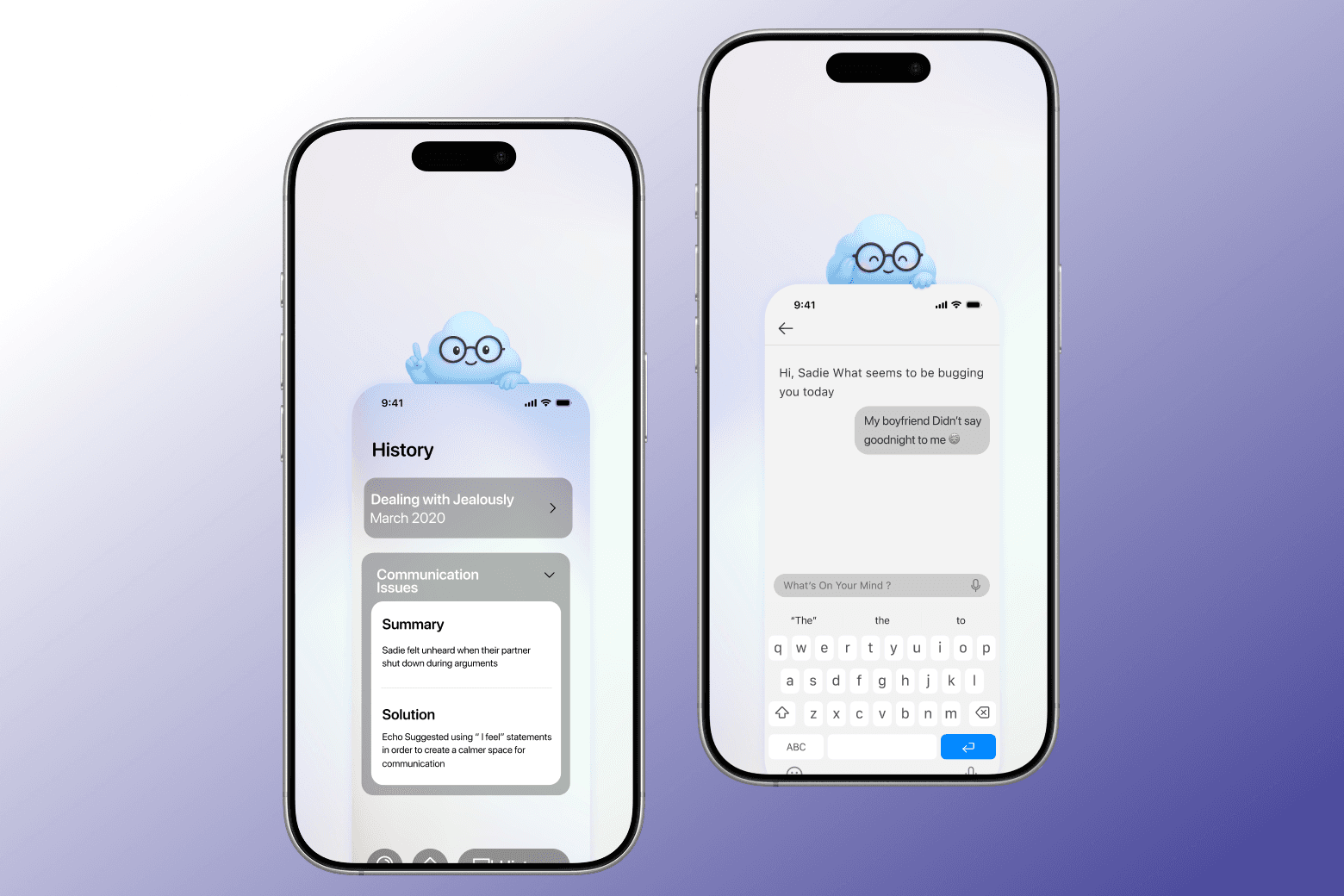
Based on our research findings, we identified three critical goals that needed to be addressed: solving immediate conflict resolution needs, ensuring security and privacy for sensitive relationship discussions, and creating personalized therapeutic experiences. The solution involved building a secure backend with Firebase to make the app secure and private, using AI chat functionality to provide 24/7 support trained on the latest therapy advice specific to relationship therapy, and implementing personalization through session summaries that allow users to action the advice they were given in the future.
DESIGN
Wireframes
I created wireframes that established the foundation for an intuitive and secure relationship therapy platform. The wireframes focused on creating a safe space for couples to communicate, with clear navigation to AI coaches, session summaries, and privacy controls. Each screen was designed to guide couples smoothly through conflict resolution while maintaining emotional safety and therapeutic effectiveness.
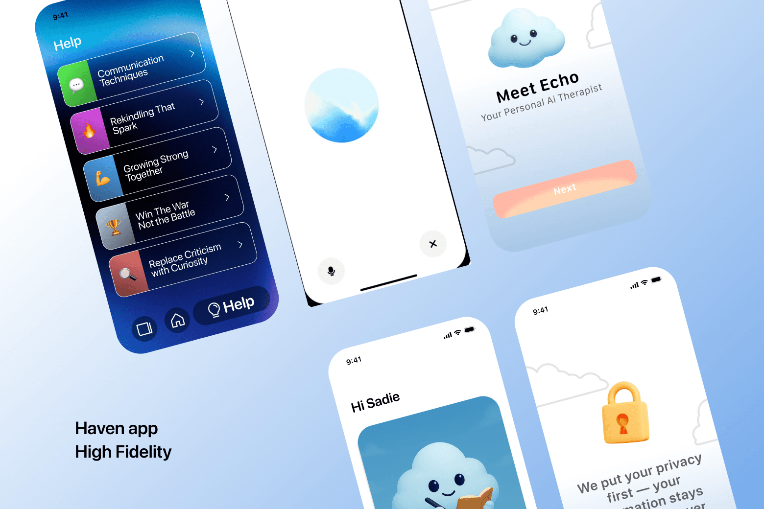
High fidelity design
The final design featured a calming, intimate interface optimized for couples therapy sessions with Firebase security integration. I ensured the design met accessibility standards while creating an emotionally safe space for couples to express themselves openly, with features that facilitated healthy communication patterns, conflict resolution, and personalized session summaries for future reference.
PROTOTYPING & DEVELOPMENT
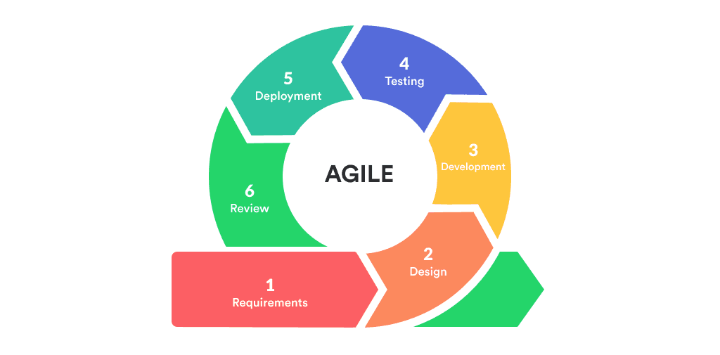
Agile Development Process
I implemented a rapid prototyping and development approach using agile methodologies. The development process focused on continuous iteration, with weekly sprints that incorporated real couple feedback directly into the AI relationship coach development. Each prototype was tested with couples experiencing actual relationship challenges, allowing for immediate validation and refinement of therapeutic techniques and conversation flows.

Technical Implementation
The technical implementation focused on building a secure, scalable platform using Swift for iOS development and Firebase for comprehensive backend services. The AI chat functionality was specifically trained on Gottman theory and relationship therapy methodologies to provide evidence-based therapeutic support. Firebase provided a secure database to store user sessions and personalized summaries, ensuring data privacy while enabling couples to reference and act on advice from previous sessions. Firebase Analytics was integrated to track user interactions and therapeutic outcomes, providing crucial data for our agile development cycle and continuous improvement of the AI's therapeutic effectiveness.
IMPACT
User experience outcomes

User Experience Outcomes
Haven AI has achieved remarkable user retention with hundreds of couples joining in the first month and continued growth through strategic marketing campaigns. The platform's agile development approach allows for constant evolution of new features that keep users engaged longer, with continuous feedback loops ensuring the product meets real couple needs. The relationship therapy platform enables couples to work on their mental health independently, with mental health scores showing significant improvement when using Haven AI compared to couples who don't use any therapeutic support. Couples using Haven AI reported 4.7/5 satisfaction compared to 3.2/5 for those without therapeutic intervention, demonstrating the platform's effectiveness in supporting relationship wellness and individual mental health within couples.
Business outcomes
The therapy market represents a massive opportunity with a market cap exceeding $200 billion globally and experiencing consistent growth year over year. Within this market, teenagers represent approximately 15% of therapy-seeking individuals, creating a significant addressable market for relationship therapy solutions. Our strategic plan focuses on capturing 20% of the teen therapy market, targeting an annual revenue of $2 per customer. With the teen therapy market segment valued at approximately $30 billion annually, capturing 20% would represent a $6 billion market opportunity, translating to significant revenue potential as we scale our user base and expand our therapeutic offerings to serve this underserved demographic.


